 Visual minimalism is the result of identifying what is essential to be communicated, then delivering it with clarity, restraint, skill, and taste.
Proximity
Proximity is putting like elements together and separating unlike elements. The proximity of two pieces of conent implies a relationship between the two items. A simple example is subheads, which go with the content that they describe. A web designer typically strives to reduce the number of visual elements on a page while successfully allocating all of the content into one of these areas.
Good web page layout facilitates designs that are built with proximity in mind. Here are some quick pointers about proximity:
- plan it out on paper first
- use space before and after elements to create gaps between groups
- if in doubt, use more white space
- the human eye detects lumps: use clumps and not clutter
- put related things near one another; put unrelated things far apart
if you don't center it, make your design obviously not centered - a whole is not simply the sum of its parts, but a synergistic "whole effect," or gestalt
A grid can be used to reduce the number of decisions required of the viewer and help increase consistency across pages. Pages treated differently will stand out, with home and internal pages being the most obvious example.
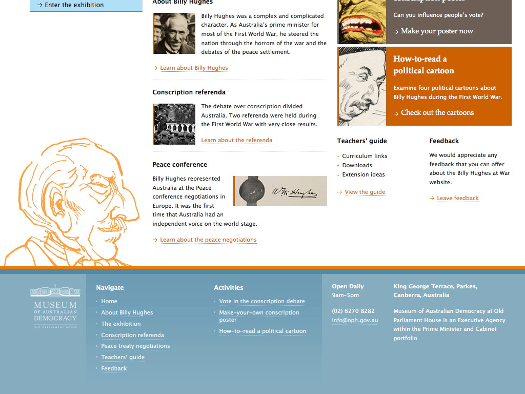
Often the footer is a key place to organize a collection of information by its proximity to each other and to the bottom of the web page.
