Navigation
![]() Remember, no matter where you go, there you are.
Remember, no matter where you go, there you are.
— Earl Mac Rauch, Buckaroo Banzai
Navigation is a system that web designers create for users to get to their destination. Several navigation systems are defined through the examples below. Large web sites often use multiple navigation devices.
For a recent overview of navigation patterns, check out Guide to Website Navigation Design Patterns.
- Left-hand panel. Commonly found across the web, an example can be found on any Google search results page.
- Page-top nav bar. A useful technique for conserving screen real estate, just like at Apple and Microsoft and this class site. Typographica uses a variation on this theme by leaving the menus open until you close them with a second click, but it's still a page-top nav bar.

- Tabs. Scotiabank and shows this navigation works as a visual metaphor for file folders.
- Breadcrumbs. Named after early navigation system designers Hansel and Gretel, breadcrumbs can be found on Yahoo directory search and on this class web site.
- Folders. Web Monkey used to provide folder icons that act similar to a computer operating system.
- Linear path. A specialized choice for digital storytelling, presentations, and problem-based learning.
- Multi-page path. Shopping carts, photo galleries, and search engines are all places to find multi-page navigation paths.
- Pull-down menus. Lynda.com uses pull-down menus extensively at the top of its home page. Pull-down menus require extra care to avoid usability and accessibility problems. The advantage is offer a large quantity of navigational choices wile conserving screen real estate for other purposes. The page-top nav bar for this class site has a pull-down menu feature.
- Search box. The New York Times has one and so does Nature and just about every other large site. This is the first thing that a significant population of users will look for on a large site. Not only does it capture that large user base, but it works as a backup option for users who are successful with your navigation.
- Image maps. Investment Management & Planning required an image map as an entry point to its site. A pull-down menu was used as a complementary navigation device.
- List of links. Scroll to the bottom of Expedia's home page for an example of lots of links, listed out and loosely grouped.
- Circular navigation. Not suitable for all content, but it's an unusual approach that can set a site apart from others. The Smithsonian Institution's Ocean Portal is one example.
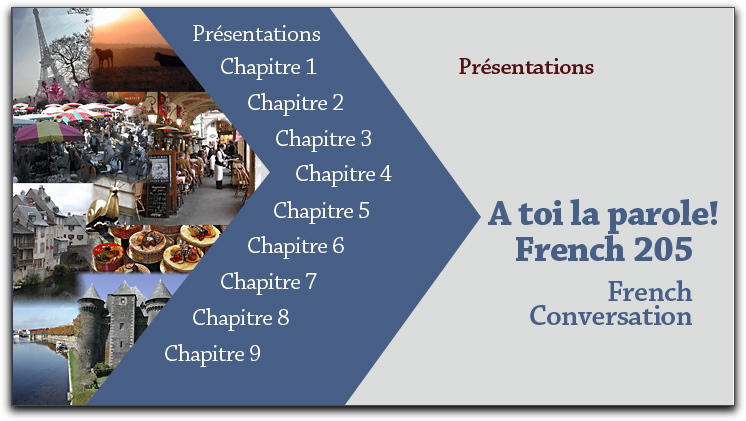
Navigation systems for web sites sometimes carry over into navigation systems for CDs and other projects. The example above, presented in class from a DVD, features an interactive user interface created by Debbie Jeffers for use in Lysette Hall's French 205 class at the University of Delaware.

Class exercises
- Impose a layout on the page of content using CSS divisions.
- Create a page layout of your own, based on an artist or other web site inspiration.
- Use diigo account for one good, bad, or ugly entry
- In Photoshop, remove the background from an image and save for web
- Establish (and follow!) your own set of file naming and management conventions
