Contrast
 Visual minimalism is the result of identifying what is essential to be communicated, then delivering it with clarity, restraint, skill, and taste.
—Steve Barrett, Werkhaus Design
Contrast occurs when two elements are different in size, color, value, or type. Use contrast to emphasize what is important to the reader's eye.
Contrast with type
The larger size of the heading text contrasts with the adjacent content. Simply using strong (bold) and emphasized (italics) text can provide another level of contrast. ALL CAPS offers contrast, although it's easily confused with unwanted SHOUTING at the reader. More subtly, a change of font face can invoke contrast. Notice that contrast only works if the nearby text elements are not headings, bold, italics, or all caps. One of the most important contrasting text elements must be your hyperlinks (in all four of their states).
Contrast with color and texture
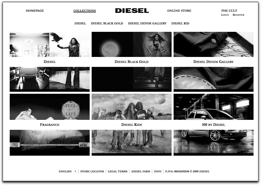
We'll talk more about color and texture as a separate topic and see how many principles of web design overlap. For now, here's an example of black-and-white contrast.
Contrast with layout

Contrast with space
Insufficient contrast means poor readability
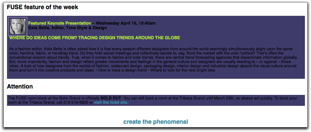
Fuse branding and design conference